Over time, you might find choosing the right exterior paint color overwhelming, but the best place to start is with your roof color. Your roof sets the foundation for harmonious and visually appealing color combinations that enhance your home’s style and curb appeal. Whether your shingles are dark or light, pairing your paint color thoughtfully can prevent clashing colors and ensure your home stands out positively in Winnipeg’s unique environment. With the right guidance, you can confidently select exterior colors that complement your roof and transform your home’s appearance.
Key Takeaways:
- Begin your exterior color selection by considering your roof color, as the right paint shades complement and enhance the overall look of your home.
- Darker roof shingles paired with lighter paint colors create an attractive contrast, while tone-on-tone schemes offer a modern, cohesive appearance.
- Choosing harmonious colors for your exterior not only boosts curb appeal but also highlights architectural details and reflects your home’s style.
Let Your Roof Be Your Guide
The Importance of Roof Color in Exterior Design
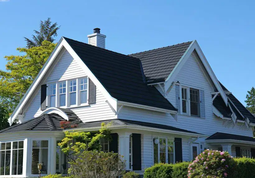
Your roof color sets the foundation for your entire exterior palette. Selecting exterior paint that complements the tones and shades of your shingles enhances architectural details, improves overall harmony, and prevents visual clashes. For instance, dark roof shingles paired with lighter or neutral paint colors, such as taupe or soft gray, create a striking contrast, while tone-on-tone schemes lend a sleek, modern appearance. Matching or blending roof undertones in your paint selection ties the elements together seamlessly, giving your home a balanced and intentional look.
How Roof Color Influences Home Value
A thoughtfully paired roof and paint color can significantly boost your home’s market appeal and value. According to real estate studies, homes with cohesive exterior color schemes often sell faster and for up to 5-10% more than those with mismatched or outdated colors. The right combination highlights your home’s best features and signals to buyers that the property has been well-maintained and cared for, making it stand out in a competitive market.
Beyond curb appeal, roofing and paint color choices can affect perceptions of quality and style. For example, pairing a gray roof with modern charcoal or slate siding evokes a contemporary vibe attractive to urban buyers. In contrast, earthy tones with brown roofs appeal to those seeking warmth and tradition. The synergy between these colors subconsciously increases desirability, encouraging higher offers and quicker sales, especially in neighborhoods where cohesive aesthetic standards prevail.
Navigating the Color Spectrum: How to Choose Paint Based on Roof Color
The Darker Roof Debate: Should Shingles Be Darker than Paint?
Keeping roof shingles darker than your exterior paint remains a reliable way to create a striking visual contrast. Dark shingles, such as charcoal or deep browns, beautifully offset lighter paint colors, including soft whites, light grays, and warm taupes. This contrast not only emphasizes architectural features but also prevents the overall look from feeling flat. Tone-on-tone schemes, featuring slightly varied shades of the same color, can add a sophisticated and modern touch. Balancing these tonal differences helps maintain harmony while allowing your home’s personality to shine.
The Impact of Roof Material on Color Selection
Roofing materials, such as asphalt shingles, metal, slate, or cedar shakes, each bring unique textures and finishes that affect how colors interact. For instance, reflective metal roofs often necessitate cooler paint hues to balance their sheen, while cedar shakes complement warm, earthy tones that highlight their natural grain. Asphalt shingles with subtle undertones—reds, greens, or grays—can guide you toward selecting paint that either complements or contrasts to enhance curb appeal.
Digging deeper, the material’s texture can influence how light plays across your home’s surfaces, altering color perception throughout the day. Slate roofs with deep, rich hues often pair well with muted neutrals, creating an elegant and timeless look. Meanwhile, the rustic appearance of cedar shakes works beautifully with colors inspired by nature—think soft moss greens or warm, burnt oranges—that echo the organic feel. Matching paint colors too closely to a highly textured roof can dilute depth, so you might choose shades with enough contrast to highlight both elements distinctly.
Mastering Curb Appeal: A Color Strategy for Homeowners
Aligning Exterior Colors with Neighborhood Trends
Your home should stand out for the right reasons while fitting harmoniously within your neighborhood. Start by observing common color palettes on your block—whether they lean toward cool blues, warm earth tones, or classic neutrals—and use these as a baseline. When your exterior colors echo local trends without copying them exactly, your house gains a distinctive edge that resonates with prospective buyers and neighbors alike, enhancing your curb appeal without risking visual discord.
Boosting Resale Value Through Thoughtful Color Choices
Choosing colors that complement your roof and harmonize with the surroundings can increase your home’s market value by as much as 10%. Opting for popular yet timeless shades, such as soft grays, warm taupes, or muted blues, not only attracts a wider buyer pool but also highlights architectural details that might otherwise be overlooked. This strategic use of color turns your home into “that house” people remember—and want.
Several real estate studies reveal homes with coordinated exterior colors receive faster offers and higher sale prices. For example, in Winnipeg’s diverse climate, pairing a darker roof with lighter, neutral walls reduces heat absorption and improves visual appeal year-round. Subtle accent colors on doors or trim can emphasize entryways and create welcoming focal points. Thoughtfully selected colors work beyond aesthetics; they signal well-maintained properties, which increases buyer confidence and ultimately, the resale value.
The Art of Harmonious Design
Complementary Colors: Finding Balance in Your Palette
Balancing your exterior colors with complementary tones creates a cohesive and inviting look. For example, if your roof carries warm brown hues, pairing it with soft greens or stone grays can highlight the architectural details without overpowering the eye. Conversely, with a cooler gray roof, hints of deep blue or muted yellow can add vibrant contrast while maintaining harmony. You want to choose colors that complement your roof’s undertones, ensuring your palette flows naturally rather than fighting for attention.
Using Accents to Elevate Your Home’s Aesthetic
Accent colors on doors, trim, and shutters can transform your home’s exterior from ordinary to stunning by adding layers of visual interest. Consider a bold navy door against a soft beige façade with a charcoal roof, or a vibrant red garage door paired with a taupe body and dark shingles. These small but deliberate choices draw the eye to focal points and add personality without overwhelming the overall scheme.
Deliberate accent choices enable you to highlight architectural features, such as window frames, porches, or dormers, that might otherwise blend into the background. For instance, painting trim a crisp white on a darker house can make intricate woodwork pop, while a brighter door color invites warmth and approachability. Accents also help break up large expanses of siding, providing rhythm and balance that complement your roof and main paint color perfectly. Mixing finishes—such as matte trim with satin doors—adds a subtle texture that elevates curb appeal and encourages a thoughtful, layered design approach.
Decoding Roof Colors: Tailoring House Colors for Different Roof Types
| Roof Color | Recommended House Colors |
|---|---|
| Green | Warm neutrals, such as white, taupe, peach, cream, soft grays, and varying shades of green, can help shift the style from cottage to contemporary. |
| Brown | Earth tones such as tan, rust, soft greens, with options for vibrant contrasts or darker shades like hunter green for a historic feel |
| Gray | Grays with similar but lighter undertones, mossy greens, charcoal, slate, and accent tones in green, blue, dark red, or yellow |
| Darker Shingles | Use lighter, brighter paint colors for contrast, such as whites, light grays, or pastel tones, to make architectural features pop. |
| Light Shingles | Select darker or more saturated colors to add depth and dimension, avoiding tonal clashes. |
Vibrant Pairings for Green Roofs
For a roof with green shingles, opt for a lively color palette to balance that dominant shade. Soft peach or creamy hues create a tropical, relaxed atmosphere that is fitting for coastal homes or those seeking a bright, inviting façade. Pairing green roofs with lighter neutrals, such as white or taupe, gives your house a polished, charming cottage look. Combining grays and diverse green tones can also modernize the overall appearance, perfect if you’re aiming for a contemporary edge.
Earthy Combinations for Brown Roofs
Brown roofs offer versatility through their rich undertones, ranging from oranges to reds, greys, and greens. Using earthy paints like tan, rust, and muted greens highlights the natural warmth of your roof, delivering a grounded and inviting feel. Don’t hesitate to introduce vibrancy or bold accents, especially if your home has a historical or rustic architectural style.
You can further enhance your home’s personality by selecting a darker, moodier palette, such as hunter green, which echoes those earthy elements while adding depth and character. This approach provides a classic, vintage appeal, ideally suited to neighborhoods where historic homes are the norm. Contrasting undertones between your roof and paint bring dimension, so experimenting within the brown spectrum can produce beautifully balanced results.
Sophisticated Options for Gray Roofs
Shingles with gray tones present numerous choices due to their variety of undertones and finishes. Lighter gray homes benefit from introducing contrasting, sometimes bold colors, such as rich greens or blues, which add visual interest without overpowering the sleek roof. Darker gray roofs pair well with deeper hues, such as charcoal or slate, creating a modern and architectural statement.
Matching undertones remains key. Many gray shingles carry subtle green inflections, suggesting biophilic shades for your exterior that bring balance and harmony with surrounding nature. In warmer climates, be cautious about using very dark grays, as these can absorb heat, potentially causing exterior paint to deteriorate more quickly. Carefully selected accent colors—whether warm reds or golden yellows—can brighten the façade while respecting your roof’s cool, sophisticated tone.
Knowing these tailored options enables you to thoughtfully select house colors that enhance your roof, highlight your home’s features, and reflect your style perfectly in Winnipeg’s unique climate and setting.
The Final Touches: Leveraging Exterior Elements
Incorporating Landscaping and Architecture into Color Decisions
Your landscaping and architectural features act as natural guides in refining your exterior color choices. If your yard boasts lush greenery or vibrant flower beds, opt for paint colors that either complement or subtly contrast these hues to create a seamless visual flow. Architectural details—such as stonework, window styles, or porch columns—call for shades that either highlight their textures or blend seamlessly with their tones. For example, pairing earth-toned stone accents with warm taupes or soft greens can connect your home to its natural surroundings and elevate curb appeal in a subtle but effective way.
The Role of Trim and Accent Colors in Cohesive Design
Trim and accent colors provide an opportunity to unify your exterior palette and emphasize architectural features. A well-chosen trim color frames windows and doors, enhancing depth and definition without overpowering the primary paint. Accent colors on shutters, front doors, or garage doors can introduce personality and visual interest, linking various exterior components into one cohesive design. For instance, pairing a charcoal gray trim with a lighter gray façade and a bold red door can achieve a balanced, striking look.
Delving deeper, trim colors serve as a subtle but powerful tool to guide the eye and highlight your home’s character. Choosing a trim color that is either lighter or darker than your main paint, not necessarily matching the roof, creates contrast that amplifies architectural lines. Accent colors work best when coordinated with surrounding elements, such as landscaping or stonework, adding layers and harmony to the overall palette. In practice, you might choose a soft cream trim around windows to make detailed molding stand out, while an accent door painted in navy or olive green can anchor the entire façade and create a welcoming focal point. This thoughtful balance of trim and accent hues ensures your exterior reads as intentional and polished rather than fragmented.
Ready for a Transformation?
Steps to Take Before You Paint
Start by examining your roof’s undertones and choosing paint colors that create a balanced contrast without overpowering each other. Test samples on small wall sections to assess their appearance under various lighting conditions throughout the day. Clearing away any dirt, mildew, or peeling paint helps ensure your new colors adhere smoothly and last longer. Don’t overlook prepping trim and accent details—you want every element to work together for a cohesive, polished look.
How Professionals Can Help Realize Your Vision
Experienced exterior painters in Winnipeg know how to blend color theory with local architectural styles and climate considerations. They bring expert color consultation to pinpoint the ideal shades that complement your roof’s unique tone and your home’s personality. With the right tools and techniques, professionals can transform their vision into reality while avoiding common pitfalls such as uneven application or premature fading.
Beyond just applying paint, professionals from Lakeside Painters ensure surface preparation meets industry standards, including pressure washing and minor repairs that boost paint adhesion and longevity. They also provide accurate timelines and efficient workflows that minimize disruptions—many homes get a full exterior paint refresh in just a few days. Their in-depth knowledge of Winnipeg’s weather patterns enables them to select finishes that can withstand moisture and temperature fluctuations, resulting in a durable, vibrant exterior that lasts season after season.
Final Words
Conclusively, choosing the perfect exterior color begins with your roof color, as it sets the foundation for your entire palette. By selecting paint that complements and contrasts appropriately with your shingles, you can enhance your home’s curb appeal and highlight its unique architecture. Whether your roof is green, brown, gray, or another shade, aligning your exterior colors thoughtfully will create harmony and style that reflects your personality. For Winnipeg homeowners, this approach ensures your home looks its best while standing out beautifully in the neighborhood.
FAQ
Q: Why should I start with my roof color when choosing exterior paint for my home?
A: The roof color sets the foundation for your entire exterior color scheme. Since the roof covers a large portion of your home’s visible surface, selecting paint colors that complement the roof ensures a cohesive and attractive look. Starting with the roof color helps avoid clashes and guides you in choosing harmonious paint shades that enhance your home’s curb appeal and architectural style.
Q: Should roof shingles be darker than the exterior paint color?
A: Yes, roof shingles are generally best when darker than the paint color. Darker shingles create a beautiful contrast with lighter paint colors such as white, gray, or taupe. This contrast can highlight your home’s design and make it stand out. Alternatively, tone-on-tone color schemes in similar shades can offer a modern, monochromatic look that also works well to downplay architectural features you might not want to emphasize.
Q: What paint colors work best with a green or brown roof in the Winnipeg area?
A: For a green roof, warm neutrals like white or taupe create a charming cottage feel, while peach and cream add a tropical vibe, ideal if you want a more vibrant look. Gray and green tones can also give a contemporary and nature-inspired finish. With a brown roof, earth tones such as tan, rust, or soft greens complement the various undertones found in brown shingles. You can also choose bolder hues, such as hunter green, for a historic and elegant style. Picking colors that match the roof’s undertones will enhance the overall harmony of your home’s exterior.