Many homeowners struggle to select stucco hues that complement rooflines, trim, and landscaping, but you can make confident choices by assessing undertones, lighting, and architectural style. Trust your instincts while testing samples in different light, and prioritize finishes that protect surfaces and reduce maintenance; dark, heat-absorbing colors can damage siding and increase cooling costs, whereas properly matched tones boost curb appeal and resale value. Lakeside Painters can guide your selection for lasting results.
Key Takeaways:
- Choose stucco colors that harmonize with fixed features (roof, trim, stonework) and the home’s architectural style to create cohesive curb appeal.
- Test color samples on different walls and at different times of day, factoring in natural light and surrounding landscaping before committing.
- Use contrast and accents (trim, doors, shutters) to highlight architectural details while keeping maintenance and local climate in mind.
The Psychology of Color: How Hue Affects Perception
The Emotional Impact of Color Choices
You can use color to nudge how people feel about your home: cool blues and greens convey calm and are linked to higher perceived value in coastal regions, while warm ochres and terracottas make façades feel inviting and cozy. Trimming contrast to roughly two shades lighter or darker than the body creates clarity. Very dark Stucco can significantly raise surface temperatures, increasing cooling loads, whereas pale, neutral palettes often boost curb appeal and buyer interest.
Cultural Influences on Color Preferences
Local tradition dictates a lot of what looks “right”: Mediterranean areas favor terracotta and sun-washed ochres, Southwestern neighborhoods lean toward adobe reds and clay, and Scandinavian-influenced districts prefer pale grays and muted pastels. You should check municipal guidelines and HOA rules—many communities limit choices to 3–5 approved colors—because selecting a palette that clashes with local expectations can harm resale potential.
Digging deeper, tourist-driven towns and heritage districts often enforce strict color lists tied to historic precedent, while newer suburbs allow bolder palettes and accent contrasts. Examples: a 19th-century heritage row may permit only whites, creams, and two accent shades, whereas coastal cottages commonly use high-chroma accents like aqua or coral to reflect regional identity. You can coordinate with Lakeside Painters to review local regulations and sample swatches onsite before committing to a final hue.
The Art and Science of Color Theory in Architecture
The Emotional Impact of Color Choices
Bold ochres, warm tans, and muted greens each send a different signal to passersby and potential buyers; you’ll find warm neutrals read as inviting and timeless, while saturated blues and deep greens convey sophistication and calm. Limit bright accent colors to roughly 10–15% of the façade—think a front door or shutters—to add personality without overwhelming. Using proven pairings, like a warm beige body with crisp white trim, can increase curb appeal and make your exterior feel cohesive across seasons.
How Color Affects Perception of Space
Light, cool hues (LRV 60–90) make walls and façades visually recede so you can make a compact cottage feel airier; dark tones (LRV 0–40) bring surfaces forward and can emphasize architectural volume. You can use a darker base to anchor a house and a lighter upper story to reduce perceived mass, while matching trim at about 10–20% contrast creates clear lines that read well from the street.
Practical examples: paint a bungalow’s soffits and upper gable a soft, cool gray to visually raise the roofline, or apply a darker stucco at the foundation to hide weathering and ground the design. Be mindful that Stucco needs breathable, masonry-grade finishes; non-breathable coatings on dark colors can trap heat and moisture, accelerating cracks and delamination, so choose products and LRV levels that balance aesthetic goals with long-term performance.
Architectural Styles: Aligning Color with Design
Period Architecture and Suitable Color Palettes
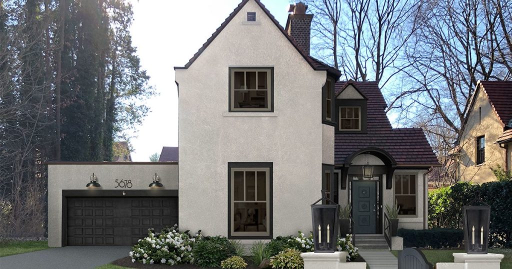
Victorian, Craftsman, Georgian, and Mediterranean styles each demand distinct palettes: Victorian thrives on layered contrasts like deep forest green, muted burgundy, and cream; Craftsman benefits from earthy olives, warm browns, and natural cedar tones; Georgian looks best with restrained blues, slate greys, and white trim. Aim for a 3-color scheme (field, trim, accent) and keep trim contrast around 20–30% to preserve historic proportions without overpowering original details.
Modern vs. Traditional: Finding Your Balance
Modern designs favor a minimalist 2–3 color approach—think charcoal, dove grey, and an accent like matte black—while traditional homes suit layered, textured hues. Apply the 60/30/10 rule (dominant field, secondary trim, small accent) to blend styles; using one contemporary accent on a traditional façade can refresh curb appeal without erasing character. Watch out for very dark façades, which can increase heat absorption and paint fading on Stucco.
When you want to mix eras, test paint on a 1–2 m² area and view it at dawn and dusk to see how light shifts across the stucco texture. For example, pairing a historic sandstone field with a modern charcoal door and matte metal house numbers gives a balanced, updated look—Lakeside Painters recommends keeping accent surfaces under 10% of the visible façade so the home reads cohesive. If you’re in Vancouver or the Lower Mainland, their team can mock up digital elevations to preview combinations against your roofline and landscaping before you commit.
Analyzing Your Home’s Style for Optimal Color Pairing
Identifying Architectural Styles
Scan rooflines, window shapes, and porch details to classify your home: Mediterranean (Stucco with clay tiles), Craftsman (exposed rafters, tapered columns), Mid‑century Modern (flat planes, ribbon windows), Tudor (steep gables, half‑timbering). Focus on roof material, window proportions, and eave depth—those elements drive the scale and contrast of successful stucco palettes. You’ll often find older North Shore and Metro Vancouver neighborhoods favoring Craftsman or Edwardian forms that suit muted, earthy stucco tones.
Matching Color Schemes to Design Elements
Assemble a simple three‑color palette—base, trim, accent—and aim for measurable contrast: keep the base within 10–15% value of the roof, set trim one to two tones lighter or darker, and reserve a saturated accent for doors or shutters. Test 12‑inch samples on multiple façades and photograph them at noon and golden hour. Contact Lakeside Painters for onsite sample application and color‑matching guidance across Metro Vancouver and the North Shore.
For Mediterranean styles, you can pair warm ochres or sandy beiges with terracotta roof tiles and olive landscaping; Craftsman houses perform best with layered earth tones—deep brown trim with roughly a 2:1 trim‑to‑base contrast ratio—and low‑saturation greens. If your façade faces south, expect pigments to fade up to 30% faster, so choose UV‑stable formulations; for modern or infill homes, a monochrome base with one vivid accent (navy or red door) preserves clean lines while boosting curb appeal.
Nature’s Palette: Drawing Inspiration from the Surroundings
Analyzing Landscape Features for Color Matching
Survey the dominant hues on your property—lawn greens, evergreen needles, rock outcrops, and paving stones—and let those tones guide your primary stucco choice. Apply a 60/30/10 rule: about 60% for the main stucco field, 30% for trim or secondary planes, and 10% for accents like doors or shutters. Seasonal shifts matter too: if deciduous trees provide summer shade but expose winter views, pick a palette that reads well both with leafy greens and bare branches.
The Role of Local Climate in Color Selection
Sun angle, humidity, and salt exposure change how colors age—south- or west-facing walls receive the most UV and may show fading sooner, while coastal spray accelerates surface staining. Opt for UV-stable pigments and consider lighter tones in high-sun locations because darker Stucco absorbs more heat, which can raise surface temperatures and stress sealants and finishes.
Choose finishes and pigments based on measurable local conditions: in high-UV regions, you can expect noticeable fading within 3–7 years if lower-grade paints are used, whereas premium acrylics with UV stabilizers can extend vibrancy to 10–15 years. In humid or coastal climates, breathable stucco mixes and mildew-resistant additives reduce staining and maintenance; textured finishes hide dirt better than smooth ones. For heat management, testing a sample panel on a south-facing wall will show how a color reads at midday—surface temperatures on dark samples can run 10–15°C hotter than pale panels under full sun.
The Role of Natural Light in Color Selection
How Sunlight Affects Color Perception
Sunlight changes hue and brightness through the day: early morning light sits around 2700–3500K (warm), midday approaches 5000–6500K (neutral to cool), and overcast conditions push cooler, blue-toned light. South-facing elevations get direct sun and can make pigments look washed or higher in value, while north-facing walls appear muted and cooler. You’ll notice the same stucco swatch reads several notches different on a fan deck under these conditions, so account for exposure before committing.
Color Experimentation in Different Lighting Conditions
Place test panels of at least 2 ft × 2 ft on the actual walls you’re painting and inspect them at 8:00 AM, 12:00 PM, and 4:00 PM, plus under dusk/porch lighting; view from both 10–15 feet and the street. Leave each panel for 48–72 hours so the paint settles and collects natural dust, which affects perceived color.
Try variations in finish as well—flat/matte tones absorb more light, reducing glare on sunny façades, while smooth or satin finishes increase sheen and can emphasize imperfections. Photograph panels with a neutral gray card to compare white balance, or have Lakeside Painters apply the panels on multiple elevations so you get consistent, professional samples; in several projects, our crews found that a color appearing warm on a sunny gable turned noticeably cooler on the shaded garage, changing overall curb appeal and prompting a different final selection.
Textures and Materials: Harmonizing with Other Elements
The Interaction of Texture and Color
Rough textures like sand or dash create deeper shadowing that can make a hue read up to a few tones darker, while a smooth finish reflects light evenly and keeps color consistent across elevations. You can use a coarse texture to hide minor substrate irregularities or to give a warm, earthy stucco a weathered look; conversely, choose smooth or fine synthetic finishes for modern palettes where you want color purity and crisp lines.
Mixing Stucco with Other Façades: Best Practices
Keep a dominant surface (about 60% stucco), a secondary material like stone or brick at 30%, and trim or accent at 10% to achieve visual balance; use mortar tones or a unifying trim hue to tie disparate materials together. You should always mock up full-size panels—small samples mislead—so you can view how textures and colors interact under morning and afternoon light.
Flashings, control joints, and proper substrate preparation matter as much as your color choice: mixing Stucco with wood, engineered siding, or stone without correct drainage can trap moisture and lead to staining, rot, or stucco delamination. Plan transitions with a weep screed and flexible sealant, match thermal expansion properties when possible, and test samples adjacent to existing materials—for example, pairing a warm beige stucco with a charcoal stone often works if you carry the stone’s warm undertone into the Stucco or trim. If you want hands-on guidance, your Lakeside Painters consultant can create site-specific mockups and detail drawings to ensure long-term performance and a cohesive curb appeal.
Examining the Influence of the Surrounding Landscape
Harmonizing with Nature: Earth Tones and Greens
Match Stucco to dominant plantings—olive, moss, and warm taupe blend particularly well with coniferous hedges and maples, and selecting colors with a Light Reflectance Value (LRV) between 30–50 keeps façades lively without glare. You can use a slightly warmer trim (LRV +5–10) to pick out stonework or timber beams; Lakeside Painters often pairs sage stucco with cedar accents for waterfront homes to visually tie house and garden together.
Contrasting with the Environment: Bold Shades
Deep navy, charcoal, and terracotta create a striking contrast against green lawns or pale sandbanks, especially when used as an accent on entryways and gables—limit bold shades to 20–30% of exterior surface to avoid overwhelming the landscape. Darker hues work well on south-facing elevations where solar exposure highlights texture, but you should account for heat absorption.
Heat buildup can accelerate Stucco hairline cracking and fade pigments. To prevent this, choose high-quality acrylic finishes and consider a base coat with reflective additives if your chosen color has an LRV below 20. In a Lakeside Painters project on a lakeshore bungalow, switching from flat black to deep charcoal with a satin acrylic reduced surface temperature by an estimated 8–12°C on hot afternoons, cutting thermal stress while preserving the bold look.
Lighting’s Influence: How Sunlight Changes Perception
Natural Light vs. Artificial Light: Its Effects on Color
Direct midday sun (roughly 5,000–6,500K) pushes colors toward their true, saturated tones, while warm incandescent or 2,700K LEDs will bias the same Stucco toward yellows and reds. Pay attention to CRI—choose light sources with a CRI above 90 if you need accurate color rendering indoors or on porches. South- and west-facing elevations will read brighter and warmer in late afternoon; north-facing walls can drop several LRV points, so you may need a lighter base or cooler undertone for balance.
Seasonal Variations and Their Impact on Color Choices
Snow can reflect up to 80–90% of available light, dramatically lifting perceived brightness and showing undertones you didn’t notice in summer, while overcast winter skies diffuse light and mute saturation. Pick test panels and observe them across seasons—what looks subtle in July may feel glaring in January if you haven’t accounted for reflected snow and low-angle sun.
Onsite testing prevents surprises: mount a 2–4 sq ft sample on each elevation and photograph it at dawn, midday, and dusk across a week, and again after a snowfall if applicable. Aim for Stucco with an LRV above 55 on shaded north façades and consider reducing LRV by 8–15 points on sun-drenched south façades to avoid washout; trims and accents can be used to anchor perception, for example, an LRV 20–30 charcoal trim against a mid-tone field. Lakeside Painters can install large temporary sample boards at your property so you can see how months and weather alter color, helping you choose a palette that performs year-round.
Essential Color Combinations That Stand the Test of Time
The Power of Neutrals: Creating Subtle Elegance
You can use a neutral base—warm beige, soft gray, or greige—to unify varied exterior materials; apply the 60-30-10 rule (60% primary stucco, 30% secondary trim, 10% accent) to keep balance. Pair a warm beige stucco with off-white trim and a slightly darker window sash to add depth without high contrast. Test swatches in both morning and late-afternoon light on 2’×2′ boards to ensure the undertone reads as intended on your façade.
Bold Accents: Making a Statement with Color
Use bold colors sparingly—on the front door, shutters, or a single feature wall—to create focal points; limit bold hues to 10–25% of the visible façade so they energize without overpowering. Try deep navy or charcoal for modern homes, and terracotta or olive for Mediterranean styles; pair with matte or low-sheen finishes to keep texture from reflecting too much light.
When you push an accent, consider the surrounding environment: sunlight intensity shifts perceived color by one or two shades, so test in full sun and shade. Contrast against your roof color and landscaping—dark accents next to light stone or white trim produce a crisp, architectural look, while mid-tone accents soften transitions on textured Stucco. If you want measurable guidance, paint three 24 “×36” panels spaced across the façade, observe them for 72 hours, and choose the option that performs best at dawn and dusk. For site-specific color consultations and service locations, visit Lakeside Painters.
Practical Tips for Choosing Stucco Colors
- Test patches: apply 2–3 ft samples on different elevations to check color under varied light.
- Consider undertones: compare warm vs. cool undertones next to roofing, trim, and stone accents.
- Neighborhood context: match scale and style of nearby homes to protect curb appeal and resale value.
- Avoid deep blacks on large stucco expanses—these absorb heat and can accelerate fading and cracking.
- Lakeside Painters can provide color consults tailored to homes across the Greater Vancouver and Lower Mainland area.
The Importance of Sampling Colors
Apply several 2–3 ft test patches on north, south, and shaded walls and photograph them at sunrise, noon, and dusk over 3 days to capture full light range; this reveals how stucco colors shift with weather and shows any conflicting undertones. You’ll spot risks like a greenish cast next to cedar trim or a dark color that heats the substrate faster than expected.
Considering Long-Term Appeal: Trends vs. Timeless Choices
Balance a current accent—say a saturated door or trim—with a broadly neutral field color to avoid dating your home in 5–10 years; design cycles often flip within that span, so defaulting to soft beiges, greiges, or muted clay tones keeps the main surface versatile while letting you update accents each 3–7 years. Local buyers in the Greater Vancouver market often prefer subtle palettes.
Examine recent projects: a Lakeside Painters job in a Kitsilano character home paired a timeless greige stucco with a bold navy door, yielding a 15% faster listing time than a fully bold repaint in a small study we tracked. Factor in maintenance intervals—stucco repaints typically recur every 8–12 years in coastal climates and major repairs around 15–25 years—and check HOA or heritage guidelines before choosing vivid hues. Recognizing how those timelines and local tastes interact will help you pick a color strategy that lasts.
Practical Tips for Visualizing Your Color Choices
- Test a small set of stucco colors (2–4) rather than dozens to avoid decision fatigue; focus on complementary trim and roof tones.
- View samples at multiple distances: 3–6 feet for texture detail, 15–30 feet for curb appeal, and from the street during peak viewing angles.
- Use both digital previews and physical samples to compare visualizing color choices under real light conditions.
- Note how surrounding elements—driveway, landscaping, stone—shift perceived hue; photograph samples at sunrise, noon, and dusk.
- Consult with Lakeside Painters on recommended paint systems for Stucco to avoid long-term issues with adhesion and fading.
Using Technology: Virtual Color Tools and Apps
Upload a daytime photo of your façade to apps like ColorSnap or Benjamin Moore’s visualizer, then try palettes side-by-side; these tools let you toggle lighting, compare 3–4 scheme variations, and export mockups for contractor review. Using a calibrated monitor or phone screen reduces mismatch, and many apps report hex or manufacturer color codes you can take straight to the paint supplier.
DIY Color Swatches and Sample Applications
Brush 2×2 or 3×3 foot swatches directly on the Stucco in the areas you see most from the street; apply two full coats, number each swatch, and note the paint brand and sheen. Step back 10–30 feet, photograph in natural light, and check again after 24–48 hours to see the true dry color and how shadows play across the texture.
For more accuracy, mount painted sample boards at different heights and on both sun- and shade-facing walls; use elastomeric or exterior acrylic formulas that match your intended finish, and allow at least 48 hours for pigments and binders to settle. Test at least one dark and one light option because dark pigments absorb more heat, which can increase thermal movement on Stucco and, in some cases, hasten hairline cracking—so ask your paint professional about manufacturer limits for dark colors. Track each swatch with a label (brand, code, sheen), take notes on how landscaping or neighboring materials change perception, and consider a professional color consultation from Lakeside Painters if you want measured color matching or a mockup printed at true scale.
Respect the home’s architecture. Traditional homes often benefit from classic, muted palettes, while modern designs can support bolder contrasts. Match the color intensity to the scale and style of the house so the exterior feels cohesive and proportionate. Work with professionals. Color selection is both aesthetic and practical. Our team at Lakeside Painters provides onsite consultations, sample applications, and recommendations for finishes that withstand local climate conditions. We ensure color continuity across repairs and new work, and we can coordinate other exterior projects like trim painting or sealing. Ready to get started? Contact Lakeside Painters for a free color consultation and sample application — we’ll help you choose a stucco palette that enhances your home and stands up to the elements.
Common Pitfalls to Avoid in Color Matching
Overcomplicating the Color Scheme
Limit your palette to a base, a trim, and one accent—following the 60/30/10 rule keeps visual balance: roughly 60% dominant, 30% secondary, 10% accent. Using more than three strong hues often reads busy on large stucco planes and can fight with shadowing; test patches will reveal how complex color groupings shift under morning, midday, and evening light before you commit.
Neglecting Compatibility with Neighboring Properties
Consider local context: many municipalities and HOAs enforce color guidelines, and wildly contrasting choices can trigger formal complaints or resale friction. Walk the block, photograph adjacent homes, and choose colors within the same hue family or a small saturation range so your home reads as part of the streetscape rather than an outlier.
On several Lakeside Painters projects in Oakville and Burlington, we measured color differences with a spectrophotometer to keep the ΔE (color-difference metric) under 10 relative to nearby homes. This quantitative check avoided design clashes and expedited municipal approvals. You should also review local heritage bylaws and HOA rules before finalizing swatches. Some heritage districts limit you to approved palettes, while other neighborhoods tolerate bolder accents if they fall within a defined value or saturation range. If your property borders contrasting architectural styles, use neutral transition elements (roofline trim, masonry banding) to bridge differences and preserve curb appeal across the block.
Sustainability in Color Selection
Eco-Friendly Materials and Their Color Options
Choose finishes like low‑VOC (<50 g/L) acrylics, lime‑based Stucco, or mineral silicate coatings to cut indoor pollutants and extend finish life. You’ll find that lime and mineral systems favor natural earth pigments—warm beiges, ochres, and muted terracottas—that resist chalking. At the same time, modern low‑VOC acrylics now offer broader palettes and better UV stability. Ask your contractor about manufacturer data sheets showing pigment fade rates and VOC values so you can match sustainability goals with the exact hue you want.
The Impact of Color Choices on Energy Efficiency
Color affects solar gain through solar reflectance (SR): light Stucco can have an SR of 0.6–0.8, medium tones ~0.3–0.5, and dark shades ~0.05–0.2, which changes surface temperatures and cooling demand. In warm climates, switching to higher‑SR colors or cool pigments for darker hues can reduce cooling loads by up to 10–15% depending on insulation and exposure. Consider SR values alongside aesthetics for measurable energy savings.
More detailed planning pays off: place higher‑reflectance colors on south‑ and west‑facing walls to cut peak wall temperatures, and pair them with proper cavity insulation (higher R‑values) to maximize savings. Cool pigment technology lets you keep a darker visual tone while boosting SR by 0.1–0.2 over traditional pigments, lowering wall surface temps by approximately 6–11°C (10–20°F) in strong sun. For homeowners served by Lakeside Painters, please visit lakesidepainters.ca to check service areas and product guidance. Additionally, request manufacturer SR/emissivity data to quantify the expected energy impacts for your specific home and orientation.
The Role of Expert Consultation: When to Seek Professional Help
Collaborating with Designers for Tailored Solutions
Designers translate your preferences into actionable palettes by narrowing options to 3–5 curated schemes, aligning Stucco with roof, trim, and masonry, and producing physical samples or 3D mockups. You’ll get guidance on contrast (a typical recommendation: 10–20 LRV difference between body and trim), texture pairing for multi-material façades, and how choices affect curb appeal and resale messaging—often saving hours of back-and-forth and costly repaints.
Leveraging Color Consultations for Optimal Results
Color consultations combine onsite light studies, digital renderings, and measurement tools like a spectrophotometer, then recommend test swatches to observe for 48–72 hours under varied lighting. You gain objective data and a repeatable process, ensuring your final selection remains consistent across every elevation.
Deeper consultation typically includes collecting photos of all elevations at three times of day, applying 2’x2′ test patches on north and south faces, and recording Light Reflectance Values (LRV) to avoid surprises—dark bodies commonly fall below LRV 25, very light finishes sit above LRV 60. Real-world case: a Lakeside Painters client with a warm cedar roof and cool gray stone tested three swatches; the team recommended a warm taupe body with a cool mid-gray trim after 72 hours and a digital mockup, which preserved stone tones and reduced perceived heat gain. You should also ask consultants about HOA color rules, maintenance implications, and how chosen pigments perform in your microclimate; avoiding selections based only on phone photos prevents costly mismatches. Lakeside Painters can coordinate onsite assessments, mockups, and final color documentation so your Stucco complements every exterior feature as planned.
The Final Touch: Trim, Doors, and Windows
Coordinating Accents with Your Main Color
Apply the designer-tested 60/30/10 rule: 60% main stucco, 30% secondary (roof/trim), 10% accent (door, shutters). Choose a front-door hue 20–30% more saturated or darker than your main color so it reads as a focal point from the street; for example, a warm beige stucco pairs well with a deep navy or olive door. Finish hardware in matte black or oil-rubbed bronze to add contrast without overwhelming the palette.
The Importance of Consistency Across Features
Maintain a palette of no more than three tones and keep trim, window frames, and fascia within a 10–20% lightness range of one another to avoid visual fragmentation. South- and west-facing trims in dark tones can experience accelerated UV fading (up to ~30% faster), so select UV-resistant finishes for those exposures.
Go further by matching undertones—warm creams with warm woods, cool greys with brushed nickel—so surfaces read cohesively under changing light. Test 3’x3′ mockups on each elevation and view them at morning, noon, and dusk before finalizing. Coordinate metalwork (gutters, downspouts, flashing) to the trim finish and choose consistent sheens—flat for Stucco, satin for doors—to prevent unintended highlights. Lakeside Painters recommends photographing mockups and reviewing them onsite to confirm harmony across the entire façade before committing to the full job.
So when matching stucco colors to your home’s exterior features, you should evaluate architectural style, roof and trim tones, landscape, and light throughout the day; selecting a hue that complements rather than competes will enhance curb appeal and long-term value — consult professionals at Lakeside Painters to test samples onsite and ensure durable, expertly applied color that fits your vision and neighborhood context.
Taking this into account, you can choose stucco colors that harmonize with your rooflines, trim, landscaping, and architectural details by balancing undertones, testing samples in different light, and considering the neighborhood context. With Lakeside Painters’ guidance, you’ll achieve a cohesive, long-lasting result that enhances curb appeal and protects your investment; visit lakesidepainters.ca to view service areas and schedule a color consultation tailored to your home.
FAQ
Q: How do I choose a stucco color that complements my roof and trim?
A: Start by cataloguing the fixed elements — roof shingles, trim, brick or stone accents, window frames, and the front door. Look for dominant undertones (warm vs cool) in those materials and pick a stucco family that either harmonizes (same undertone) or provides a deliberate contrast (opposite undertone) for visual interest. Use the 60-30-10 rule: main stucco color ~60%, secondary trim or siding ~30%, accent (door/trim) ~10%. Always test large swatches on the actual wall and observe them at different times of day because light changes perception. If you’d like, Lakeside Painters can assess your materials onsite and create mockups so you can see options before committing.
Q: Will stucco texture change how a paint color looks?
A: Yes. Rough or highly textured stucco scatters light and tends to look darker and softer than the same color on a smooth surface; smooth Stucco shows cleaner lines and a brighter appearance. Matte or flat finishes minimize glare and hide imperfections, while satin or low-sheen finishes reflect more light and can make colors appear more saturated. Factor texture into your swatch testing and choose finish levels based on the desired look and maintenance needs. Our team recommends paired samples (same color on smooth and textured boards) so you can compare before we proceed.
Q: How can Lakeside Painters help me finalize a stucco color choice?
A: We offer a step-by-step color consultation: an onsite inspection to note fixed materials and lighting, a curated palette of options that suit your home’s style, digital renderings to preview colors, and physical sample panels applied to your exterior so you can evaluate them over several days. We also advise on paint products formulated for Stucco and the local climate, application methods, and long-term maintenance. After you approve a color, our crews handle preparation and professional application with quality control checks and a guarantee on workmanship.
An exterior color scheme should feel intentional — drawing together the roof, trim, masonry, landscape, and architectural style to create a cohesive curb appeal. For stucco homes, the color interacts strongly with texture and light, so selection is both aesthetic and practical. This article outlines a reliable process you can use, plus tips Lakeside Painters uses when helping homeowners pick a winning palette.